Omni Support
Using Components
Components are a form-based type of reusable content that simplifies entering information into complex design elements.
Add a component to a page:
Components can be inserted onto pages. To add a component to a page:
- When editing a page, click "Insert Component" (
 ) in the toolbar.
 - Choose the component you want, and click Insert.
- Fill out the component fields. Anything not marked "Optional" is required, and must be filled out for the component to be placed on the page.
- Click Save. The component is entered into the page with your answers.
- Continue editing the page, save to preview the component, or publish your changes onto the live site or test server.
Components will always display as a blue placeholder when editing like the image below.
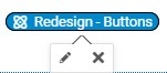
Click on a component to either edit the component (pencil icon) or delete it from the page ("x" icon).
Components can be moved on a page that's being edited by selecting and dragging them to a new location on the page.
The same component can be added to a page multiple times, with unique form content for each instance.
Available Components
Last Updates
- 04/20/2023 - Auto Rotating Photo Slider
- 06/01/2023 - Box with Border and Editable section (v2) Component
- 06/01/2023 - Testimonial Component


